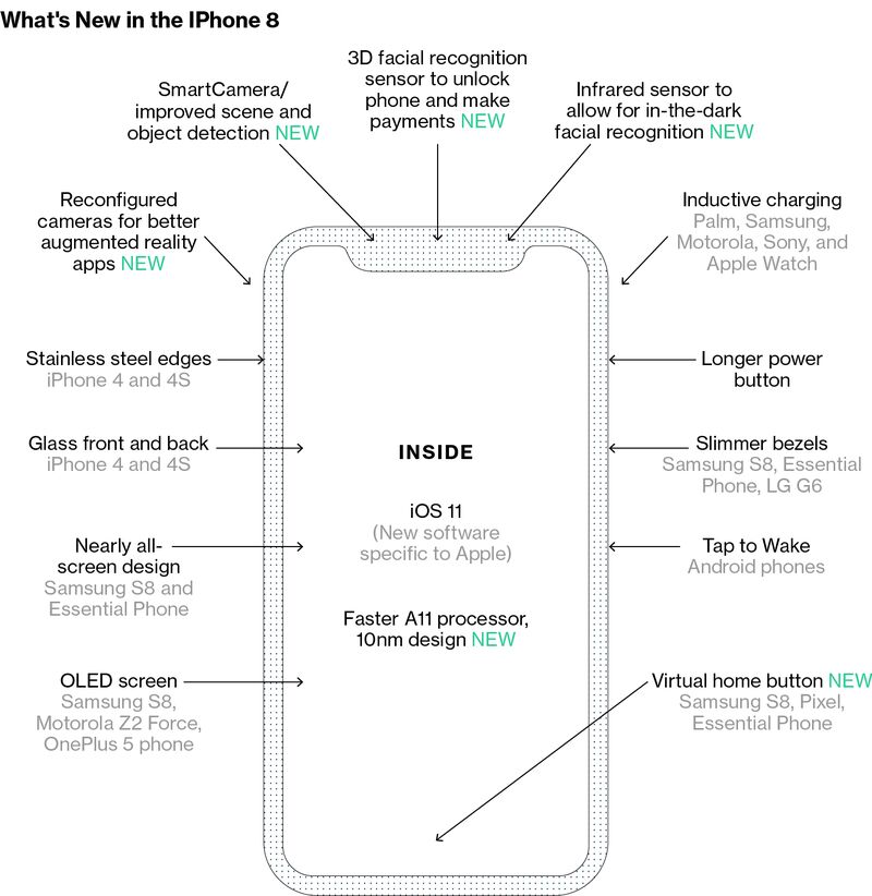
Apple Inc. plans to transform the way people use its next high-end iPhone by eliminating the concept of a home button and making other adjustments to a flagship device that’s becoming almost all screen, according to images of the new device viewed by Bloomberg News and people familiar with the gadget.
The home button is the key to the iPhone and the design hasn’t changed much since it launched in 2007. Currently, users click it to return to the starting app grid that greets them multiple times a day. They hold it down to talk to the Siri digital assistant. Double click it and you get multitasking where different apps screens can be swiped through like a carousel.
Apple is preparing three new iPhones for debut next month. One of the models, a new high-end device, packs in enough changes to make it one of the biggest iPhone updatesin the product’s decade-long history. With a crisper screen that takes up nearly the entire front, Apple has tested the complete removal of the home button—even a digital one—in favor of new gesture controls for tasks like going to the main app grid and opening multitasking, according to the people and the images.
In the new, high-end iPhone, Apple also plans a taller screen with rounded corners, a cutout at the top of the display for the camera and sensors, and new antenna locations, the images show. Apple often tests different designs and the details may differ from what the company ultimately releases. An Apple spokeswoman declined to comment.
Across the bottom of the screen there’s a thin, software bar in lieu of the home button. A user can drag it up to the middle of the screen to open the phone. When inside an app, a similar gesture starts multitasking. From here, users can continue to flick upwards to close the app and go back to the home screen. An animation in testing sucks the app back into its icon. The multitasking interface has been redesigned to appear like a series of standalone cards that can be swiped through, versus the stack of cards on current iPhones, the images show.

The new model’s overall size will be similar to that of the iPhone 7, but it will include an OLED screen that is slightly larger than the one on the iPhone 7 Plus (5.5-inches), people familiar with the product have told Bloomberg News. The phone will have symmetrical, slim bezels around the entirety of the screen, meaning the area below the screen that used to house the home button and the area above the screen for the earpiece have been removed. The earpiece, facial recognition sensor, and selfie camera are instead present in a cutout, or “notch,” at the top of the screen, the images show.
The new screen is rounded on the corners, while current iPhone screens have square corners. The power button on the right side of phone is longer so it is easier to press while holding the device in one hand, according to the images and the people.
The screen is also noticeably taller than the iPhone 7 Plus’s screen, meaning it could show more of a web page or additional text messages, the people said. The phone will still have six vertical rows of apps, showing 24 icons on each page, excluding the dock, a grey bar at the bottom that houses commonly used apps. The dock is redesigned with a new interface similar to the one on the iPad version of iOS 11, the images show.
Apple has opted to not hide the notch area at the top of the screen, showing a definitive cutout at the top of apps with non-black backgrounds. The cutout is noticeable during app usage in the middle of the very top of the screen, where the status bar (the area that shows cellular reception, the time, and battery life) would normally be placed, according to the images. Instead, the status bar will be split into left and right sides, which some Apple employees call “ears” internally. In images of recent test devices, the left side shows the time while the area on the right side of the notch displays cellular and Wi-Fi connectivity and remaining battery life. Because of limited space, the status bar could change based on the task at hand, according to a person familiar with the testing.The color reproduction of the OLED screen means that when the display shows black, it blends in nearly perfectly with the phone’s notch and thin black edges on the front, presenting a seamless look, according to the people familiar with the product. The screen itself, however, is flat like current and past iPhones and lacks the fully curved displays of the latest Samsung phones.
Apple also plans to include a stainless steel band around the phone which the glass curves into. The steel band has small antenna cuts on the corners like past iPhones to improve reception, the images show. Apple previously used steel sides and a glass casing for the iPhone 4 and 4s before moving to a mostly metal back and sides with the iPhone 5. The iPhone 6 line and newer have had completely metal backs.
Apple also is planning two additional new iPhone models that use faster processors, but include the same screens as the iPhone 7 and iPhone 7 Plus. The new devices will debut at Apple’s September launch event alongside upgraded Apple TV and Apple Watch models.
Source:-bloomberg


